Post Contents
Chicago, United States – Vladimir Radutny Architects
Built Area: 4500.0 m2
Year Built: 2017
Photographs: Mike Schwartz
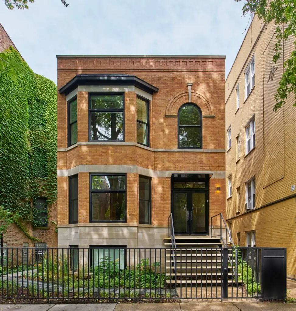
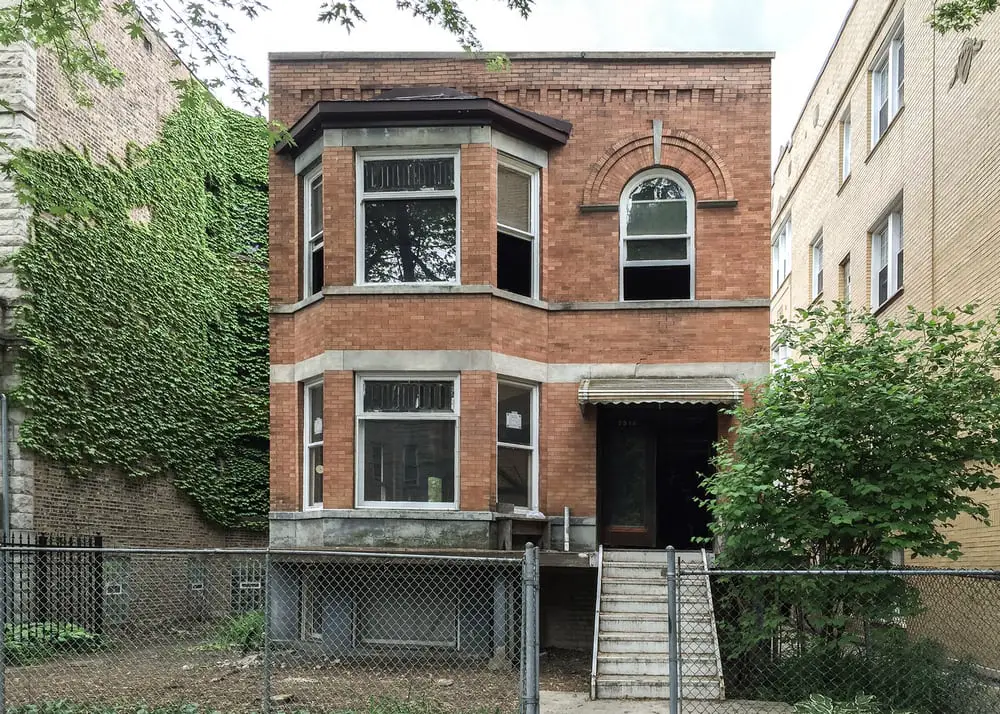
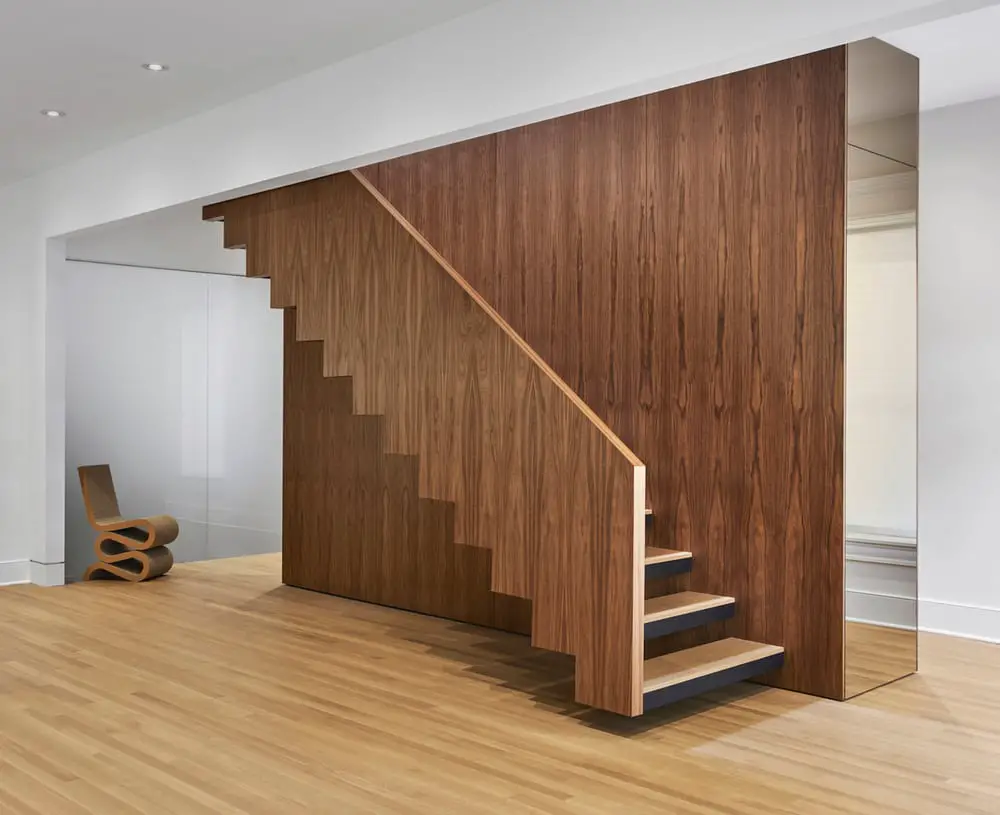
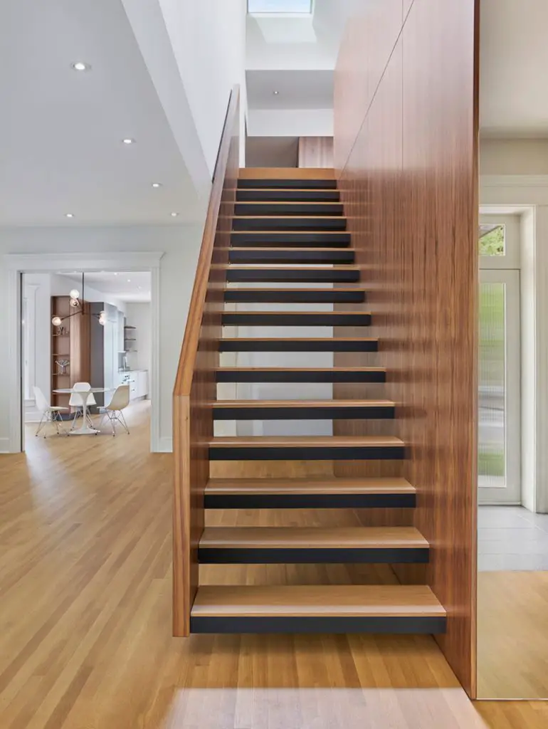
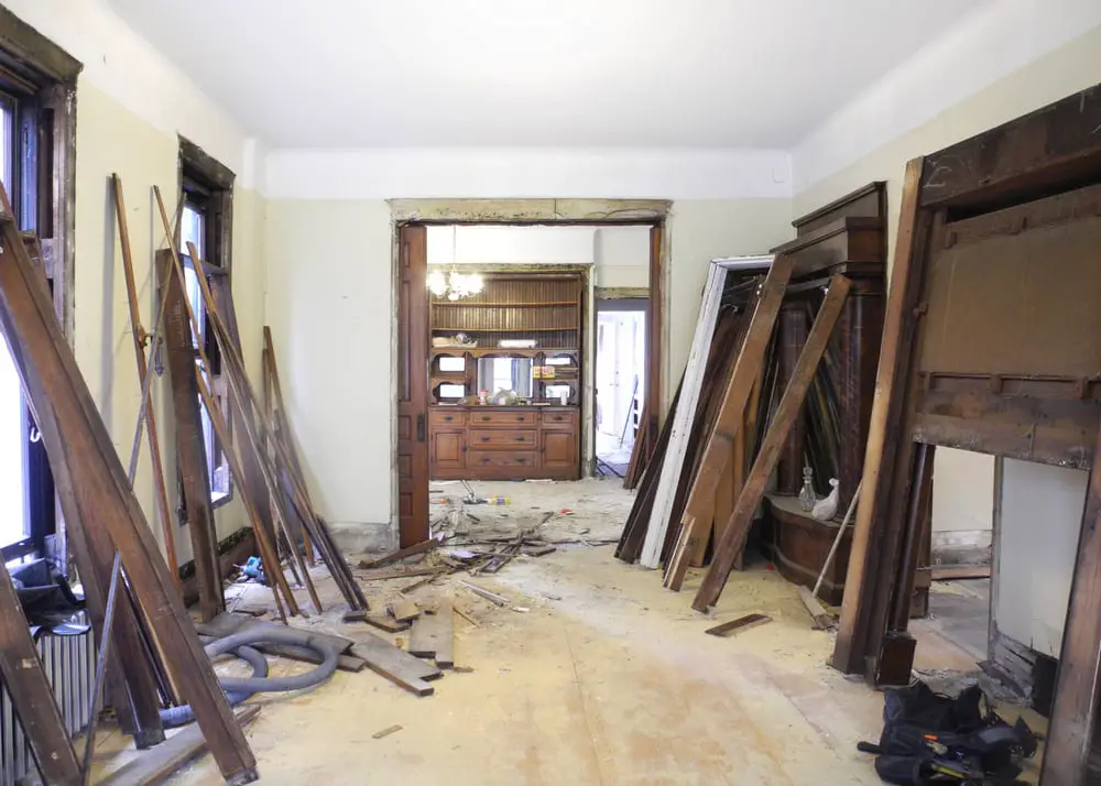
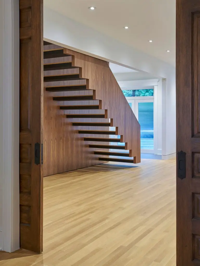
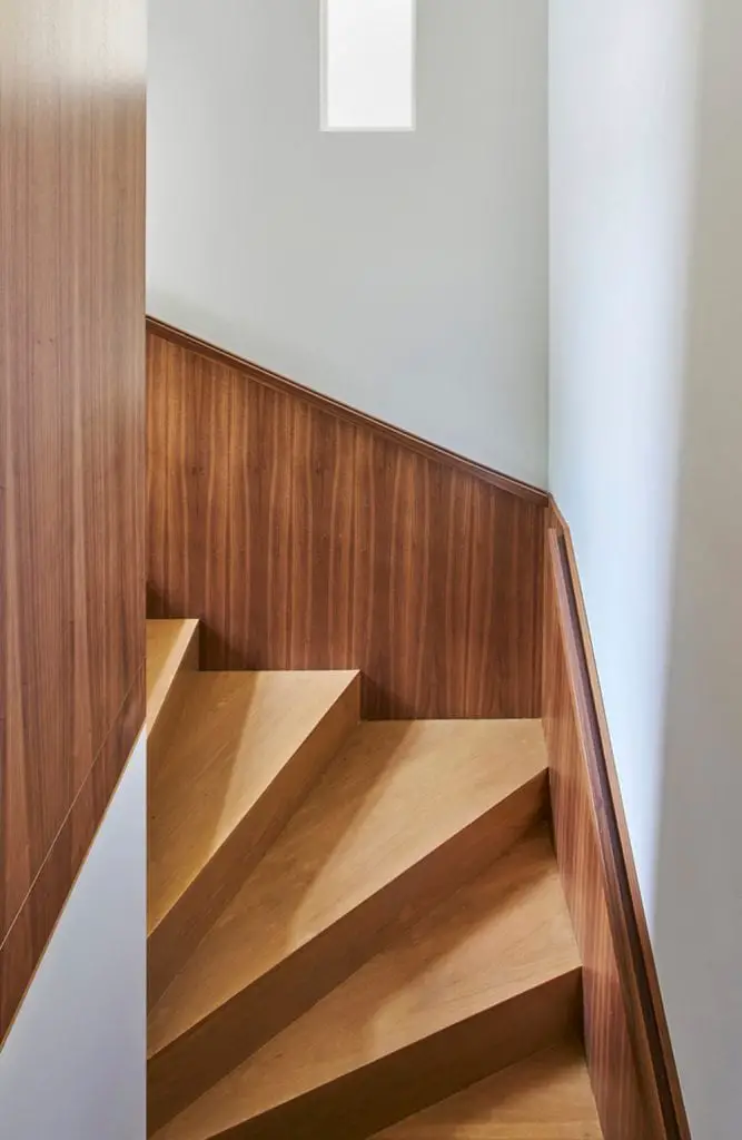
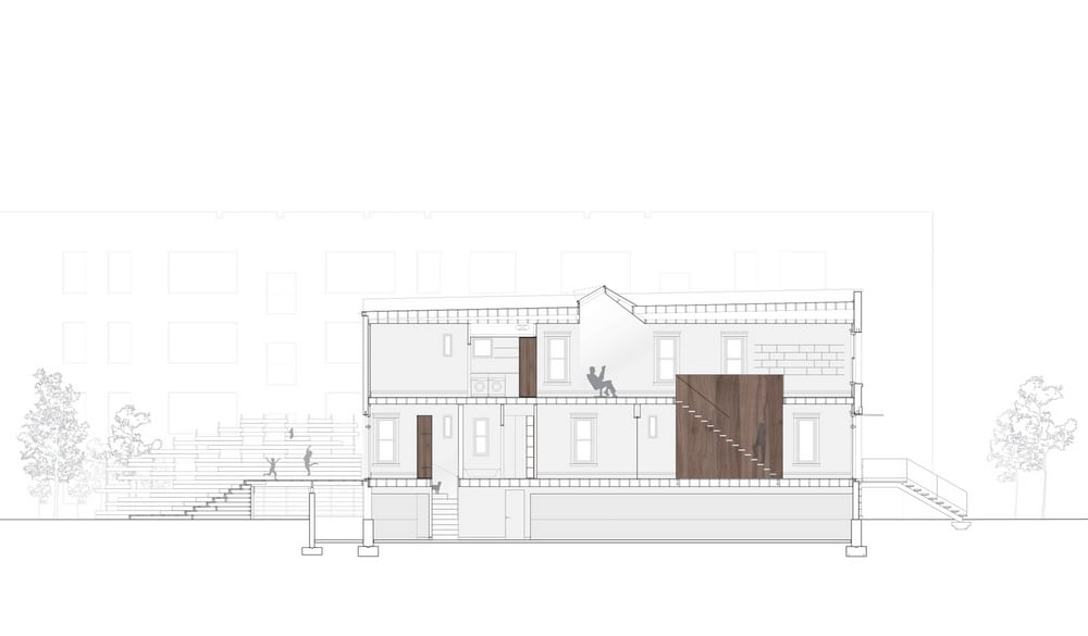
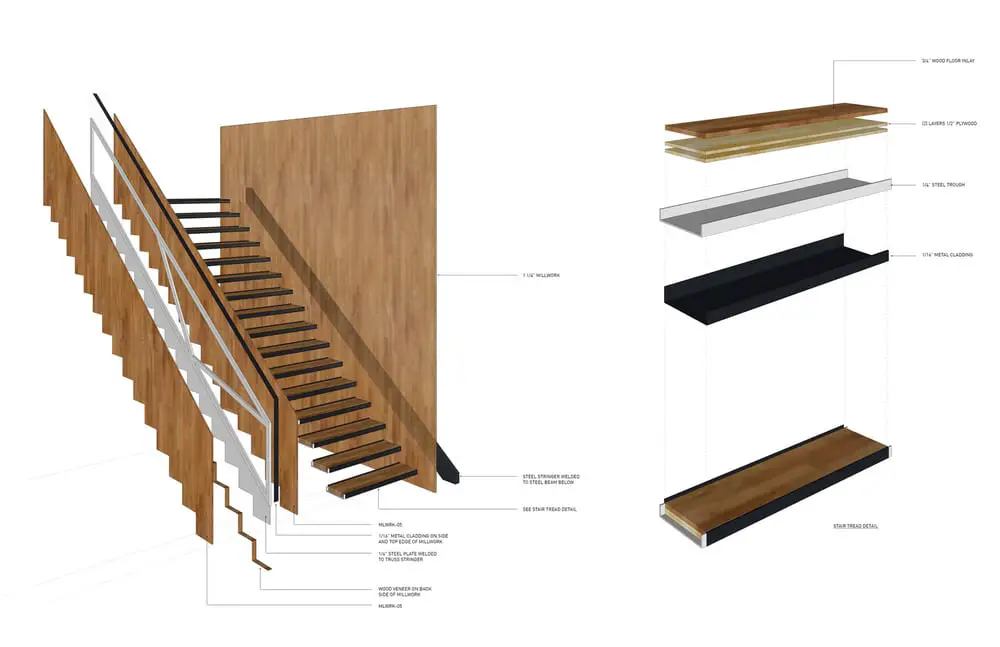
Sawyer Residence is a renovation project of a dilapidated brick structure that’s more than 100 years old. The building originally had two apartments, one on of the other. The architects connected the two separate residences using a hardwood veneer staircase.
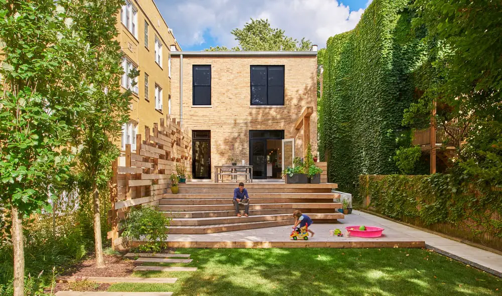
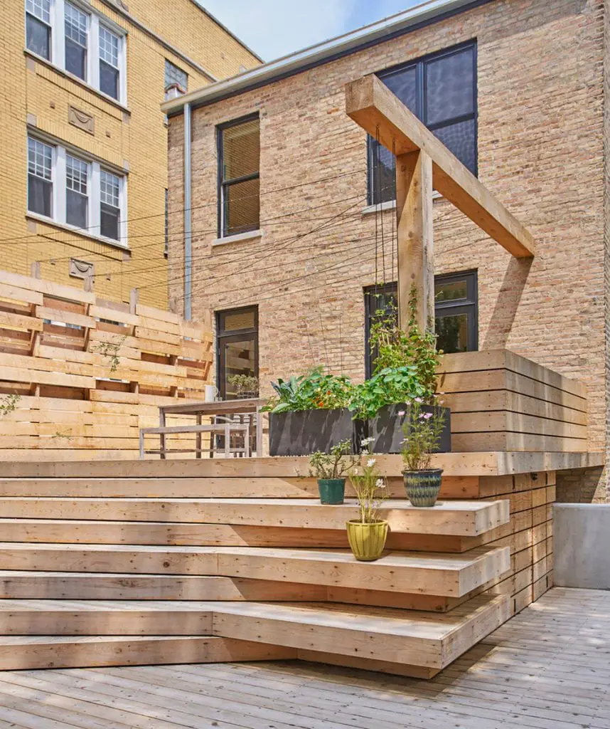
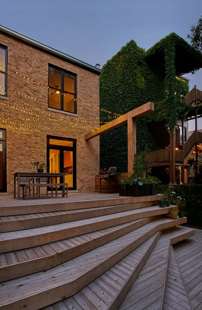
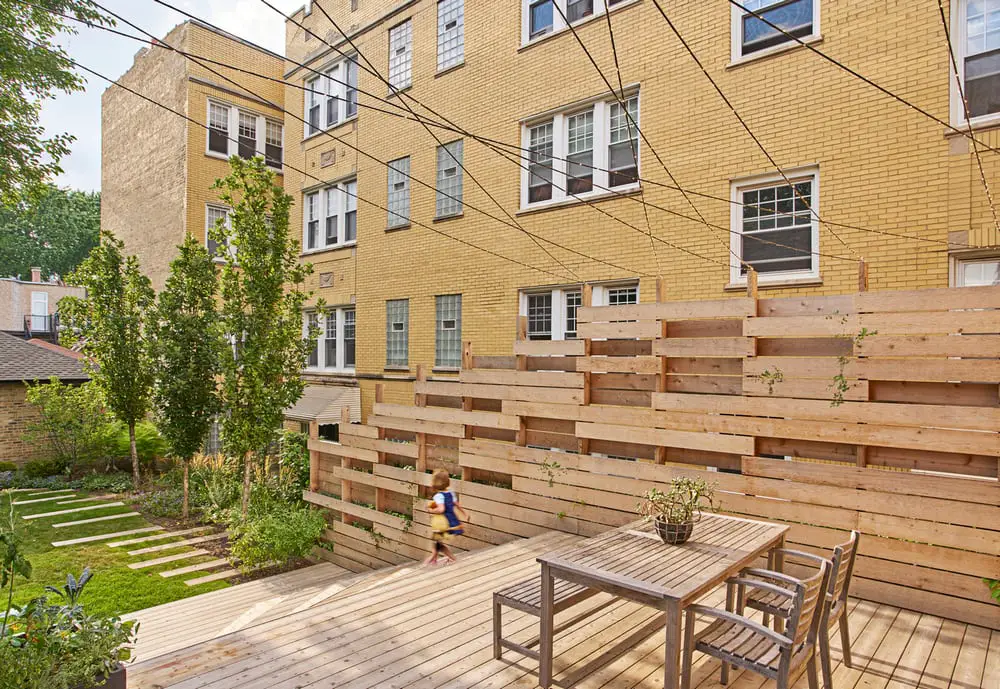
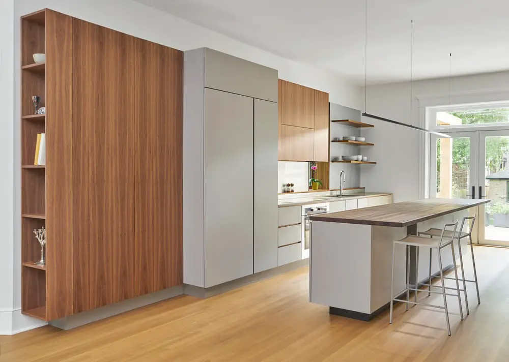
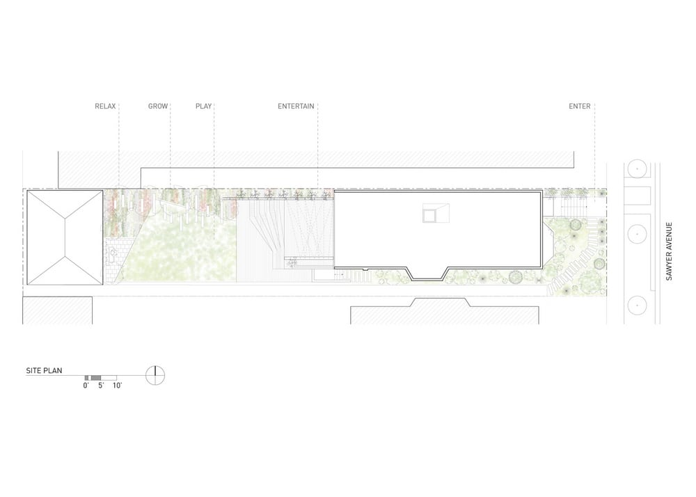
The rooms were overhauled to create a bigger and more spacious residence for a single family. Walls were ripped down and a new outdoor are was added.
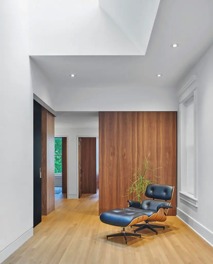
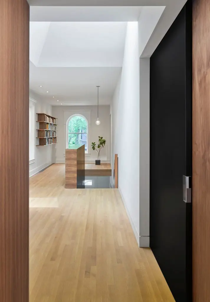
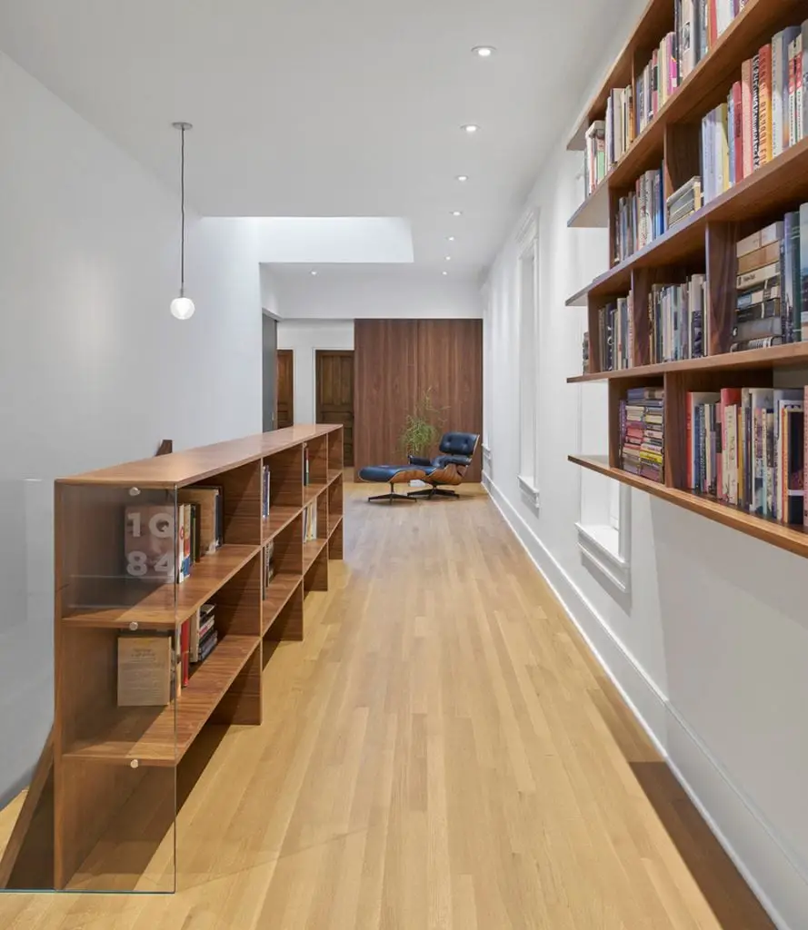
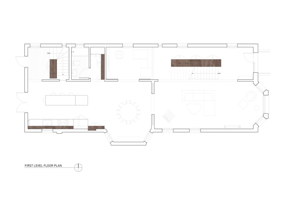
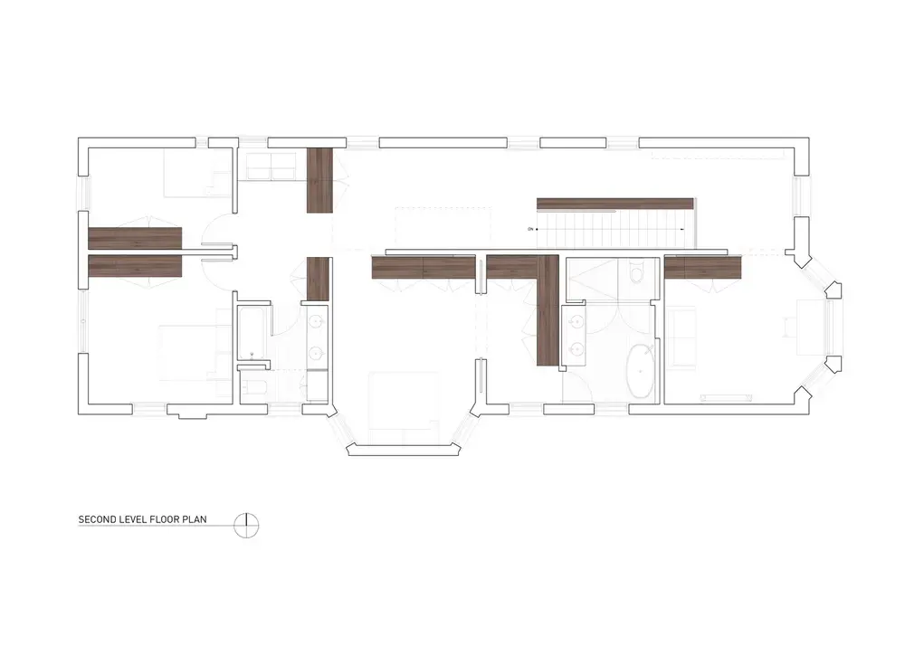
The two-story house spans 418 square meters. On the first level is the living area; upstairs, the three bedrooms are found. A skylight allows light to enter the home, providing natural illumination.
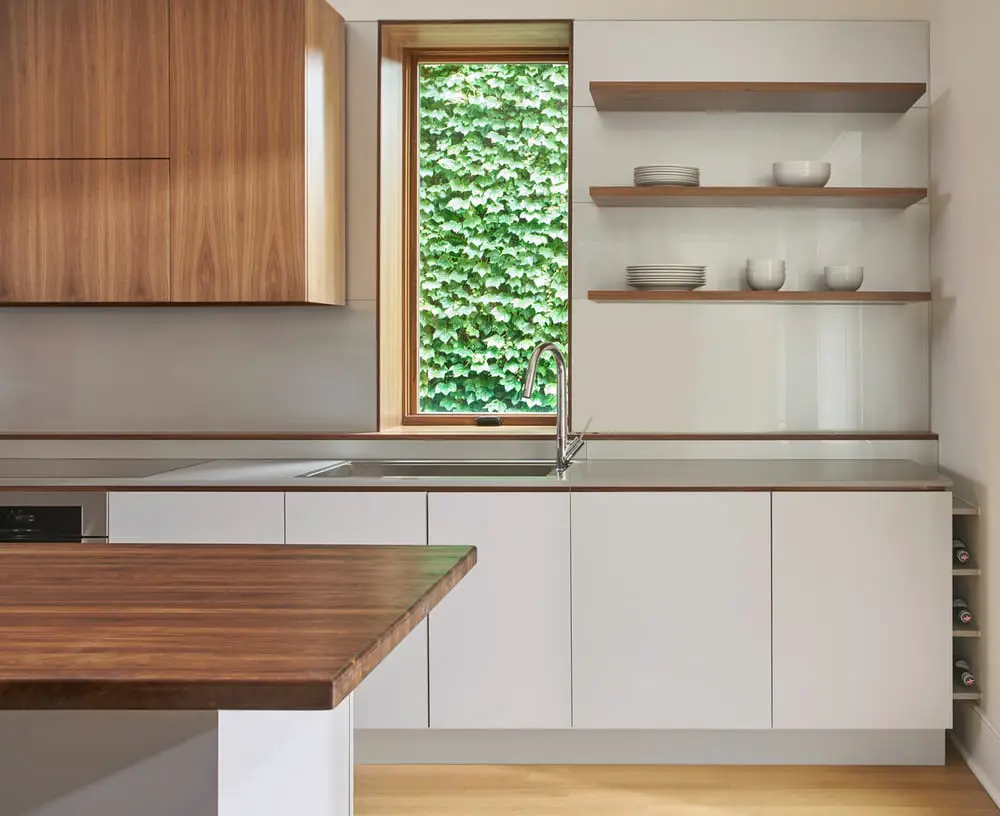
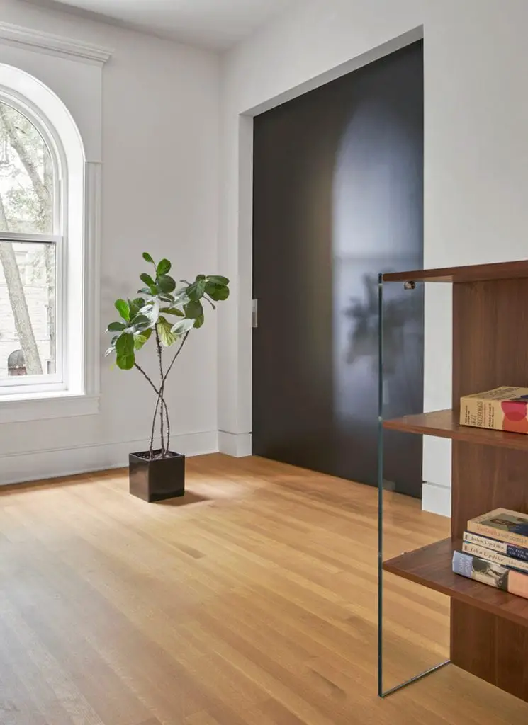
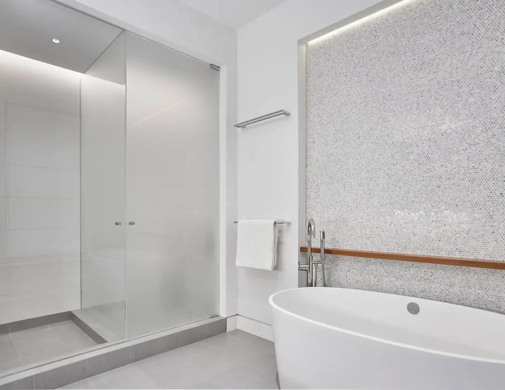
Sawyer Residence fuses the design qualities of the past with the modern lifestyle. There exists an integration of new details with the home’s original elements. The result is a home that is both cohesive and inclusive.
Notes from the Architect:
Being tasked with converting this 100 year-old dilapidated Chicago two-flat into a single family home gave us an opportunity to respond to a question: How does one preserve and integrate the intangible building qualities of yesterday and today, while breathing new life into an existing derelict shell? Our approach to the question entailed observing the existing “heaviness” of both material and space, considering the juxtaposition of restraint and ornamental excess, exploring qualities of openness alongside compartmentalization, and superimposing old craft with new traditions.
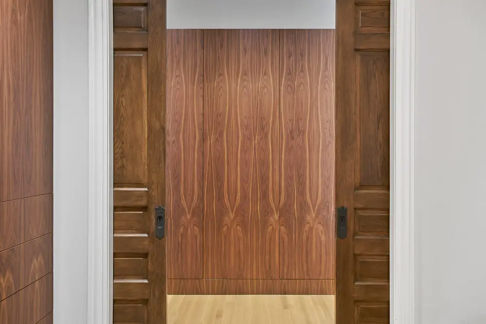
Furthermore, our interest in “phenomenal transparency” as a space-organizing strategy was tested here both in section and plan. Newly-introduced walnut millwork elements were programmed as stairs, walls and storage; these elements physically and visually cut through space, connecting rooms and their adjacent zones. Salvaged old doors, hardware, and trim were seamlessly integrated with the new architectural language, keeping the design composition cohesive, and merging past and present together as one articulated thought. The result is a home that is light, connected, and fully functional for a growing family. The project thus introduces new spatial meaning into an early 20th century building, melding qualities from the past with a design logic and lifestyle for today.
Click on any image to start lightbox display. Use your Esc key to close the lightbox. You can also view the images as a slideshow if you prefer. 😎
Exterior Views:
Interior Views:
Drawing Views:
Here’s another successful renovation project – the South Melbourne House…

