Post Contents
Pinamar, Argentina – Estudio Galera
Built Area: 290.0 m2
Year Built: 2017
Photographs: Diego Medina
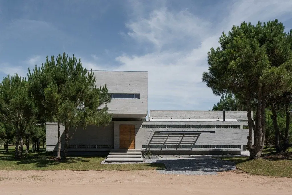
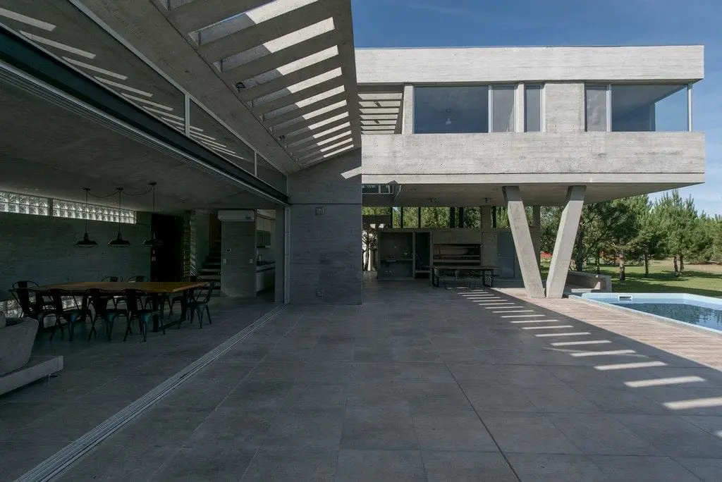
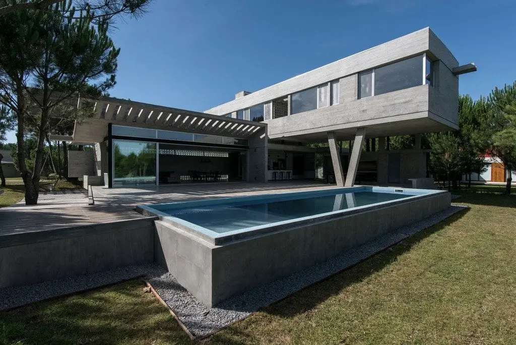
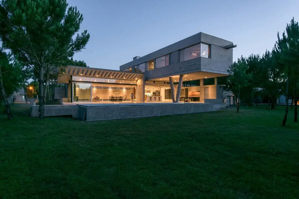
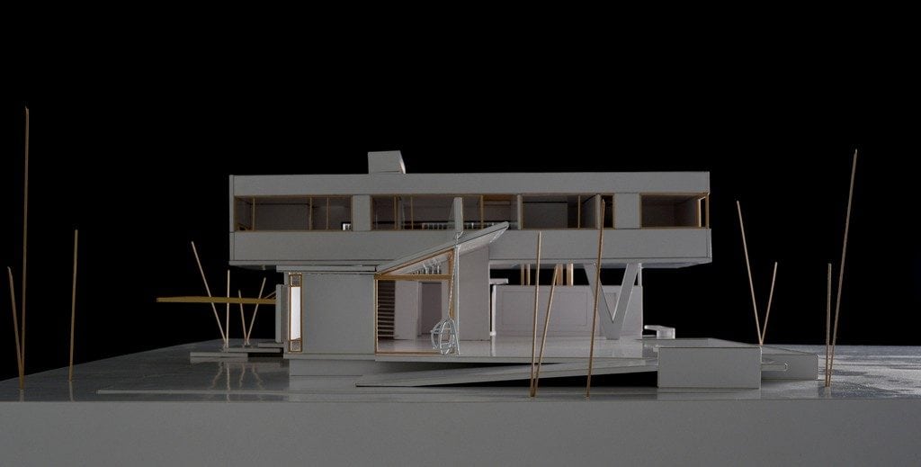
AYYA House is a contemporary home that is surrounded by pine trees. Because of its grey concrete finish, it stands out among a sea of greens. The design looks like an observatory as one part of the structure is cantilevered, kept afloat by V-shaped supports.
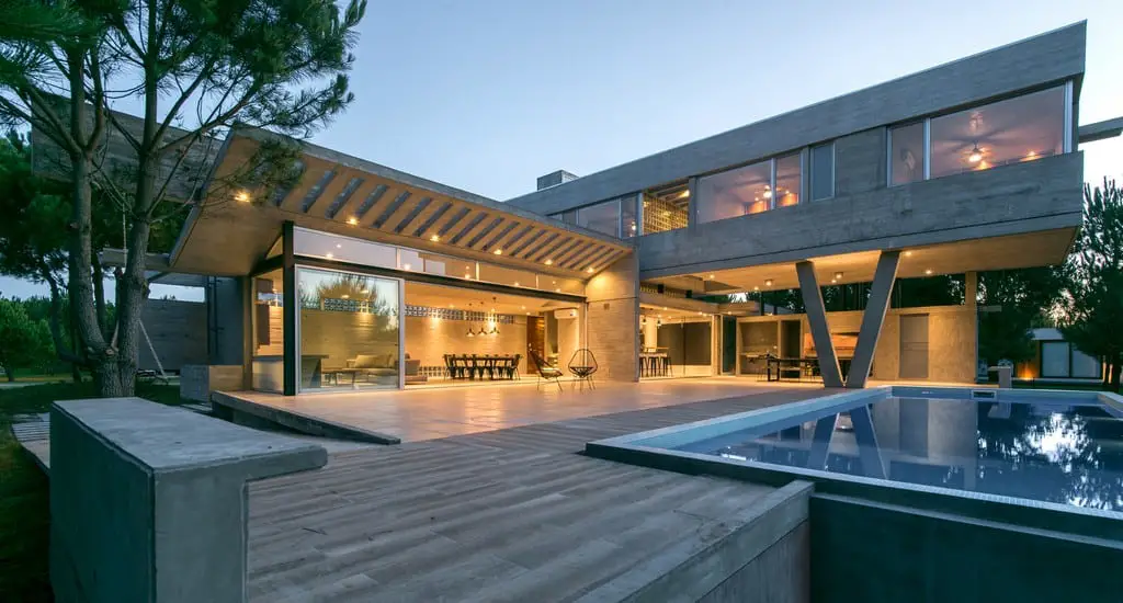
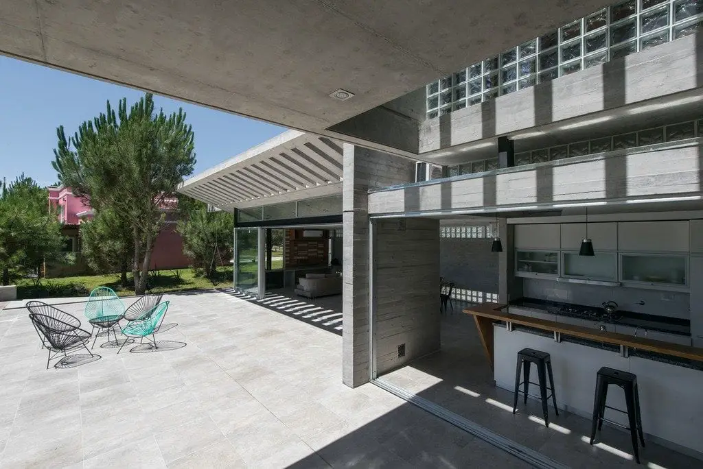
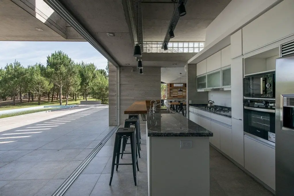
The open-plan layout at the ground level blurs the line between the indoors and the outdoors. The kitchen, living and dining areas have direct access to the outdoors via sliding glass doors. These are all located near the pool.
Upstairs, the bedroom areas, with large glass windows, provide stunning views of the pine tree-laden landscape.
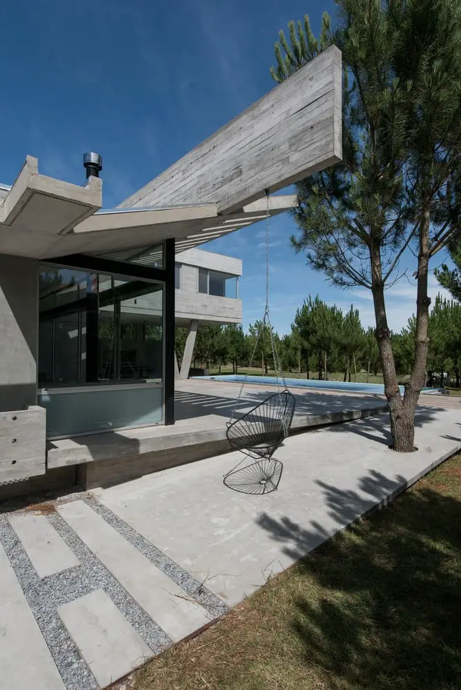
AYYA House has plenty of green outdoor spaces. A hammock in one corner provides the perfect touch for a relaxing day.
Notes from the Architect:
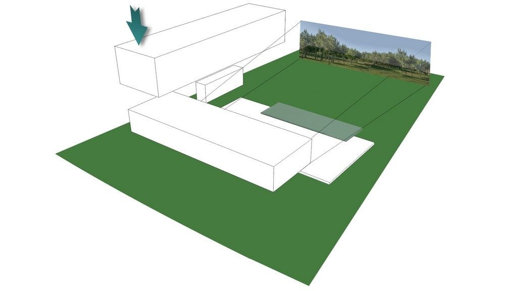
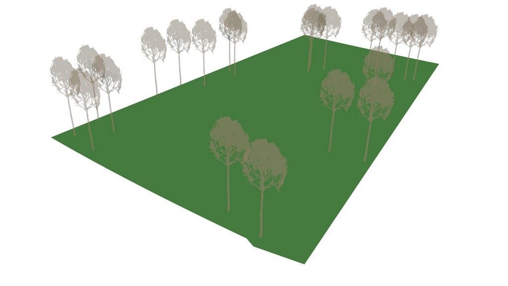
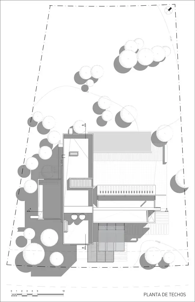
A flat lot located in a gated community in Pinamar opens as a fan from east to west, from the front –street- to the rear façade. Some young pines act as a gentle filter between the lot, the neighbors and the fields of General Madariaga –at the other side of Provincial Route 11. These comprised the first project data for a vacation home which would offer ample spaces to gather and converse bearing in mind that, on vacations, spaces are used more placidly, the senses are awake and the contemplation of the surroundings becomes a rewarding experience.
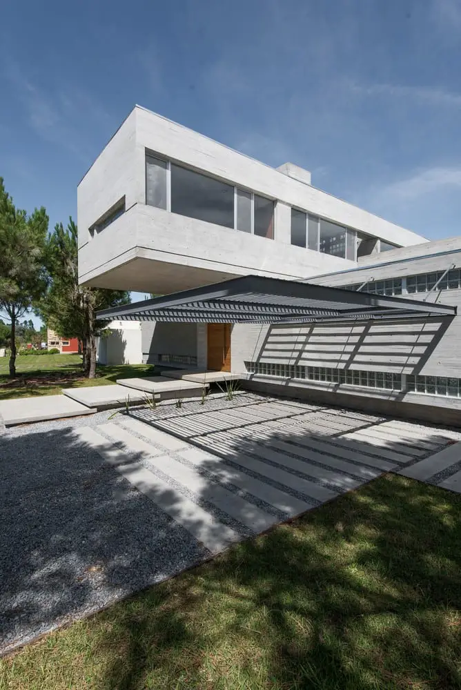
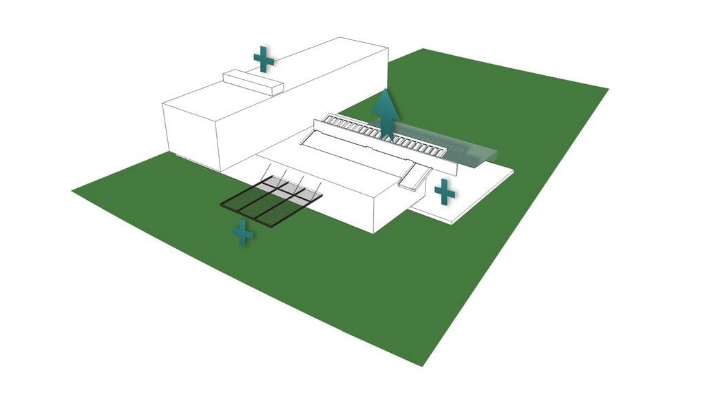
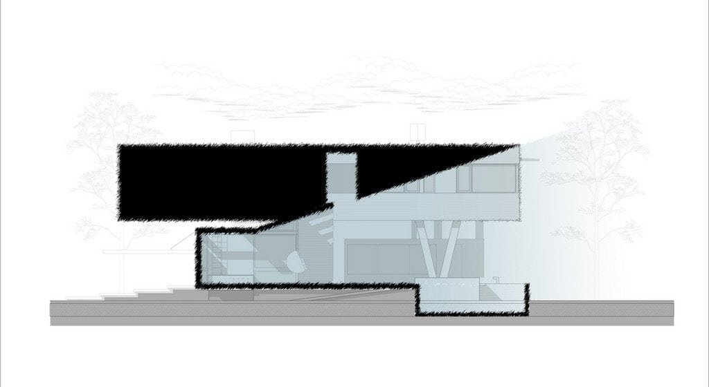
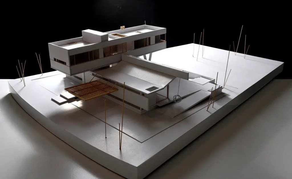
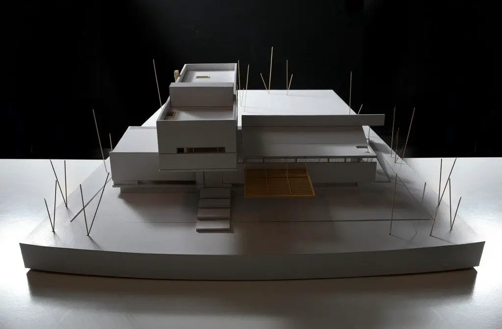
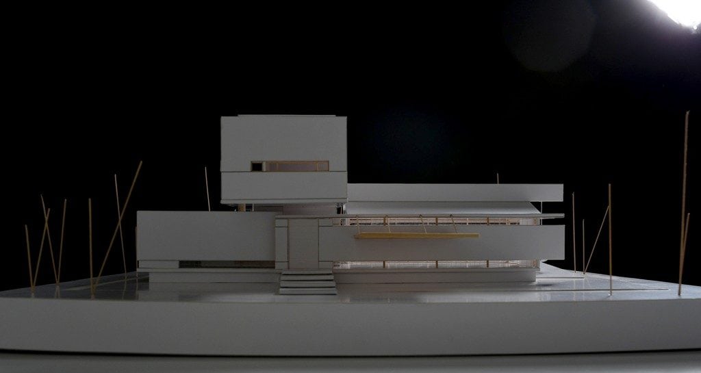
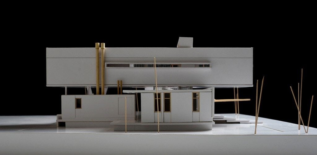
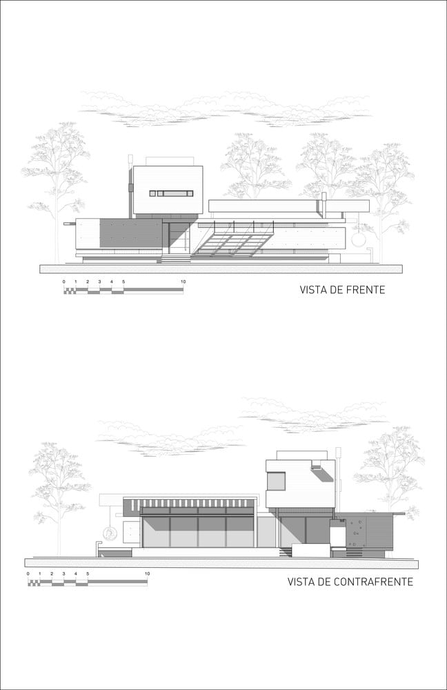
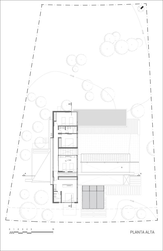
Two apparently monolithic containers are overlapped, crossed and rested on a platform to materialize the house. Lifted over the average lot level, AYYA dominates the environment and accentuates its observatory nature. The crossed boxes guarantee different views from the two plans: down to the west and up to the north and ensure good sunlight in all the rooms.
The project promotes and understands the need for social gatherings. AYYA is consequently arranged around a patio, a terrace and a pool which, like a water mirror, multiplies the effects of the sunlight.
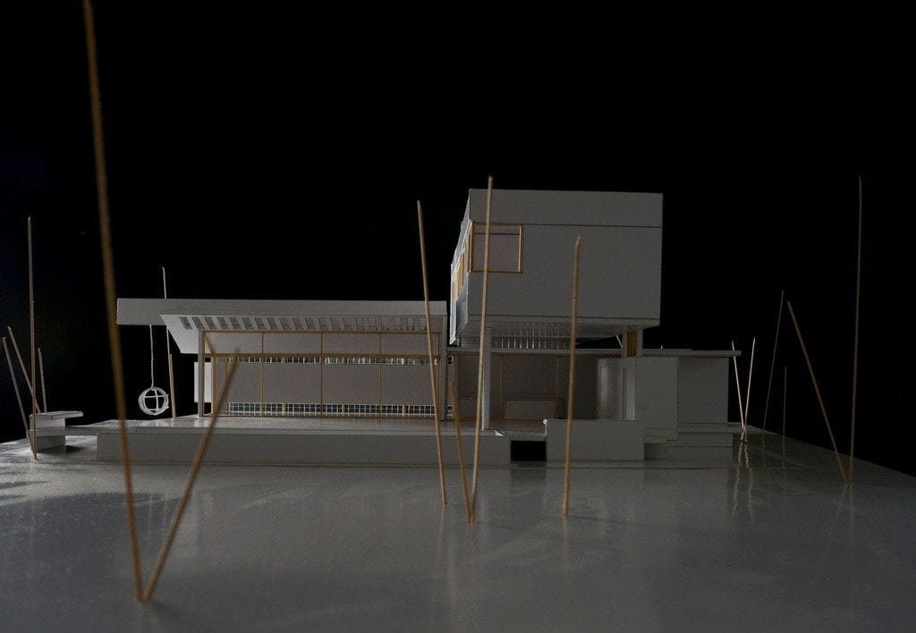
On the ground floor, the residence closes to the front so as to keep the residents’ privacy, silencing the distinctive noises of the neighborhood and reinforcing the decision of opening it to the west. The boundaries of the house disappear through the full opening of the fenestrations which generates large mixed spaces where ‘the inside’ and ‘the outside’ melt away and increases the apparent size of the house. The slab breaks away over the living-dining room and constrains -as a funnel- the transition between the inside and the outside. As in a game of opposites, the containers, roof slab and walls also act as a boundary for the residence as it is appreciated from the distant field. Over the kitchen and on its exit, the space ‘carves’ the concrete box.
The beam frees the living room from any vertical elements (columns) at the time that expands the terrace. The cantilevered beam crowns in a hammock which hangs from it. The empowerment of this element –apart from the play on compositions- highlights the vacation spirit: the gratification found in playing and contemplating the environment.
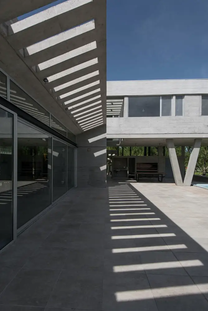
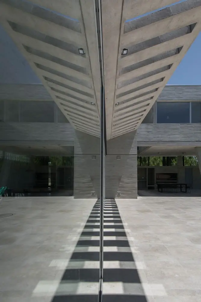
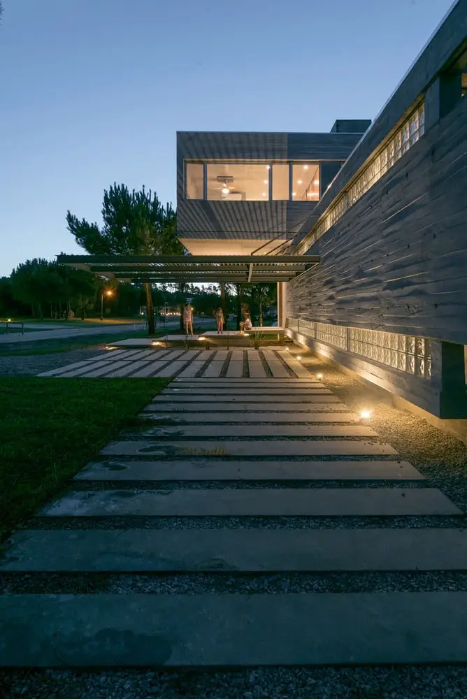
On the upper floor, a wagon which nestles the playroom and the bedrooms overhangs the platform to the rear façade offering shadow for outdoor activities. The wagon stretches to the front as if trying to blend with the neighborhood –which does not happen on the ground floor- while it seems to fly over the access plan due to the lack of supports. This solid cantilever produces strangeness and melts with the trees, extending the house into the landscape. Slightly down, another cantilever takes the shape of a pergola and connects with the first one while giving scale to the outside: a sublime carved plan that ‘stretches’ to the street projecting shadows. From a functional stance, it works as a solar shield for the vehicles.
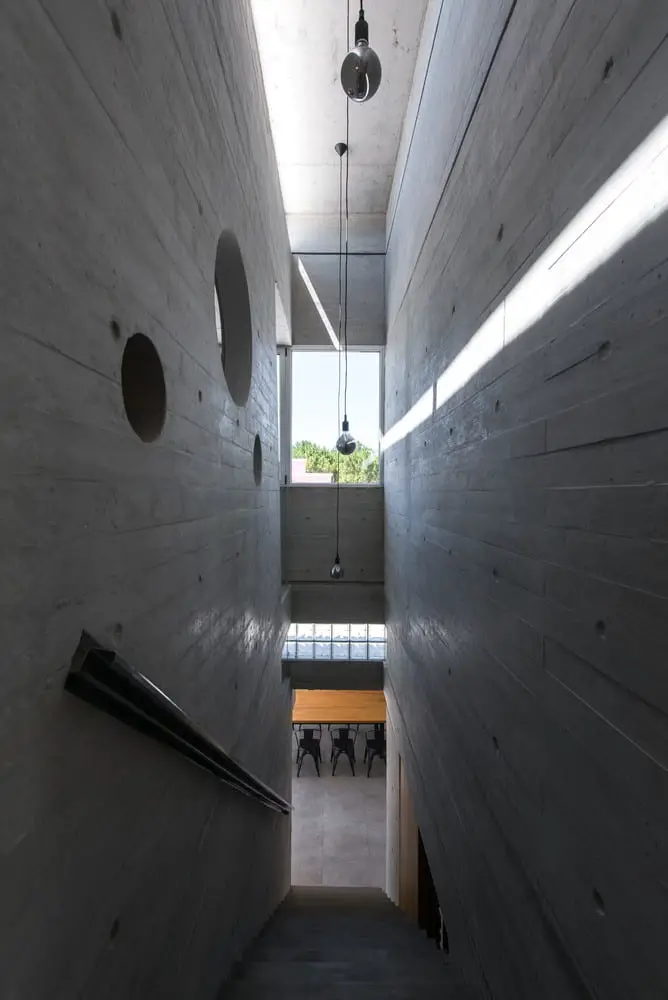
The passage of time and the course of the sun enrich the space and the sensory experience. The pergolas and the carved concrete filter the sunlight and cast shadows which horizontally and vertically travel along the surfaces.
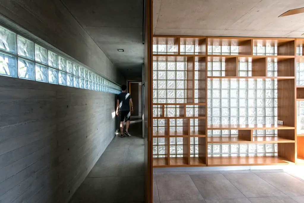
The rooms are identified by their size; they are neutral and are not coated. These spaces were not ‘labeled’ in order to give the owner flexibility of use. The marks of the formwork and its supervised imperfection are taken as accomplishments: structure, color and texture fuse, highlighting AYYA’s character.
All the materials were selected to keep the house maintenance to the minimum and bearing in mind that the effects that the climate has on them are a continuation of the building process. The interior of the concrete walls were fully filled with expanded polystyrene sheets –which were placed and adjusted during the formwork process since the concrete is all poured at once.
The materials show what they are as they do not have surface finishes. They remain –as well as the building process- directly and permanently present in the construction. The non-artifice reinforced concrete overhangs the terrain and rests upon a platform, contrasting with the typical house of the neighborhood and portraying itself as strong and radical as the countryside. The residence is transformed into an auditorium where to contemplate each sunset. This might be its biggest virtue: to capture the spirit of the countryside where every afternoon the sun goes down.
Click on any image to start lightbox display. Use your Esc key to close the lightbox. You can also view the images as a slideshow if you prefer. 😎
Exterior Views:
Interior Views:
Drawing Views:
If you love homes with lots of green spaces, then you will also love House in Nursery.


