Andrew Webb, Principal at WD Architects
Having read a couple of articles from the professional architecture media yesterday, it struck me that I am committed to and passionate about two related concepts that very few people understand with any complexity. Unfortunately, it appears from these articles as well as some of the recent award winners around the world in these fields, that even the professionals and academics often miss the point, and have been doing so for quite some time.
So, it is no wonder that most people don’t understand what “architecture” is and fewer care. It is not surprising that “sustainable” has become as devoid of meaning as most other terms embraced by governments like “accountable” and “we will never introduce (insert soon to be implemented policy here).”
However, I am passionate about and committed to sustainable architecture because together they matter…and they matter a lot. I’d like to explain it here because if you are planning to build anything then you need to understand what it means; to avoid, as I said in an earlier post, building garbage.
Here are the articles:
#1 – We don’t need another hero
#2 – What is considered architecture
The fact that these both refer to commercial and public spaces doesn’t change the relevance to owner-building.

Article #1 angers me. I get several architecture and design related blogs in my inbox every morning, skim them, find little that engages me; time is precious. Here was a headline that I expected would lead to, finally, an article about architecture and not its depiction.
What I found was several masters students’ thoughts about the depiction of a couple of colourful buildings…their conclusion basically being that there are not enough photographs of these building exteriors, so they took more themselves to post on more social media. The Myer building is, according to the article, designed to look cool from space so it looks good on Google Earth. What a load of wank; especially if that really is something the architect is considering as he designs it; I hope it is not.
So, what is the point that they sorely missed?
Architecture is fundamentally about the space, not the form, not the graphic design. It is about how it feels to work, live and play in that space – the experience in all its complexity. Design is about overcoming problems – it sounds mundane, but how far the toilets are away from the work space has a major impact on the comfort, efficiency and social interactions in the workplace.
It doesn’t matter how cool the exterior is (literally and figuratively). If you can hear noise from the toilet and the air is stuffy and the bin is always overflowing and the conversation from the coffee machine interrupts your phone conversation, then there are design flaws. (BTW I am not saying these are problems with either of these buildings, but they are real things to consider amongst many other things if these writers were really critiquing architecture and its depiction in media).
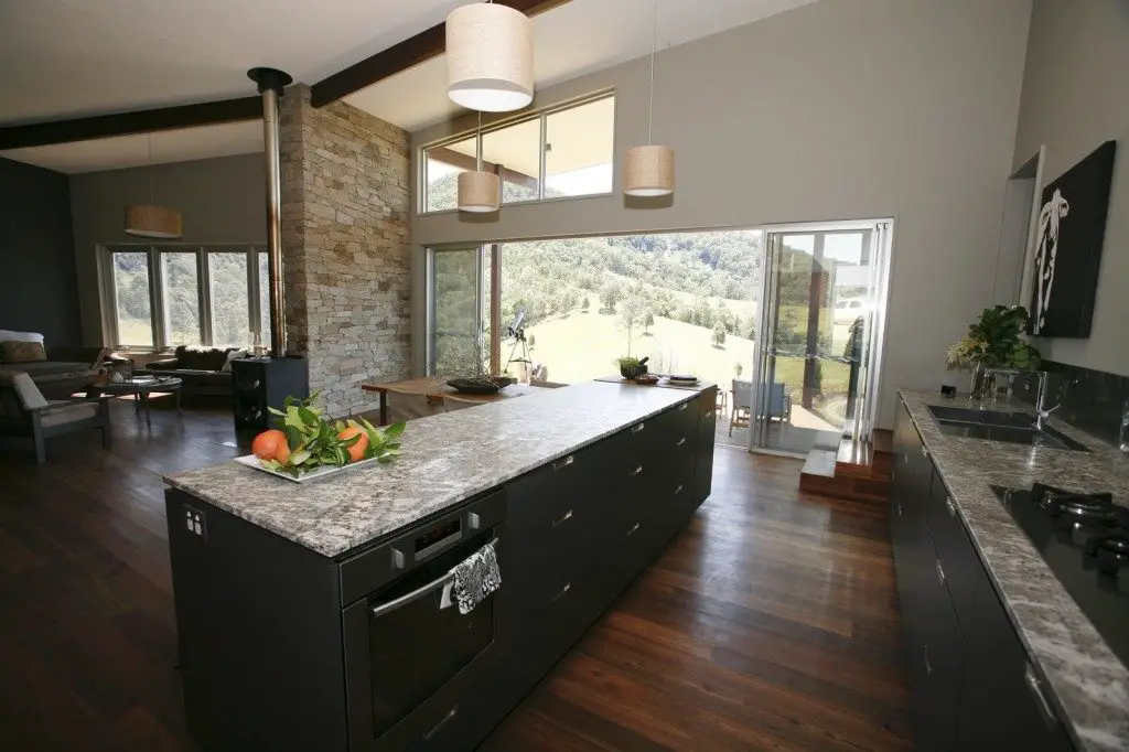
In a house, the design of your kitchen affects the social interaction, how achy your feet get when cooking up a storm, how much you feel like cooking up a storm, how safe the place is for children, pets and adults, how the smells linger or don’t, how much bending over you need to do to find things (which affects your back pain, maybe your medical insurance, how well you get to know your osteopath, your schedule, your budget), how well it’s lighted at different times of day, how easy it is to clean, how easy it is to scratch, how easily do dishes break when you fumble them…all these things affect your experience with the space and the forms…all of these things, including the visual appeal, are affected by design decisions. What it looks like is just one small aspect of the full picture.
The problem is that these things put together are hard to describe, hard to put your finger on and, in the world of Pinterest and Facebook, hard to capture in a photograph. That is the point. Architecture is not its image.
Everyone has experienced what I am talking about. Spaces are not neutral. You don’t walk into a public toilet and think this would make a great living room (usually), you don’t go to a doctor’s clinic and think this would be a great place for entertaining; and likely you wouldn’t want it to be. You know when you enter a room that just feels right; you are very lucky if you can articulate why that is.
Equally, you know when you enter a place that feels bad – claustrophobic, dirty, unsafe, slippery, dark, too bright, hot, cold, stale, etc.. As with many things, it is often easier to say when things are not right. The trouble, I believe, is that often the buildings we occupy can be just a bit off, just slightly wrong somehow that you can’t put your finger on..so much so that you probably don’t realise that the unsettled feeling you have is from the design of the place you’re in and not what you had for lunch.
In the second article, Melanie Dodd has a significant observation, “Young, cutting-edge architects in Australia face a totally different challenge, probably one that is more about form making.” More on this in my next post.


