Post Contents
Dromana, Australia – Vibe Design Group
Built Area: 796.0 m2
Year Built: 2018
Photographs: Jack Lovel
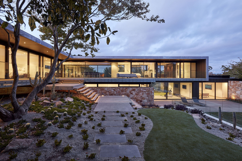
Moat’s Corner House stems from the owner’s desire to build a home that respects the integrity of its location. They wanted a new design that showcases a refined setting but still staying true to its heritage. With its new phase, the house is now an interactive haven. It allows the homeowners to enjoy everything it has to offer.
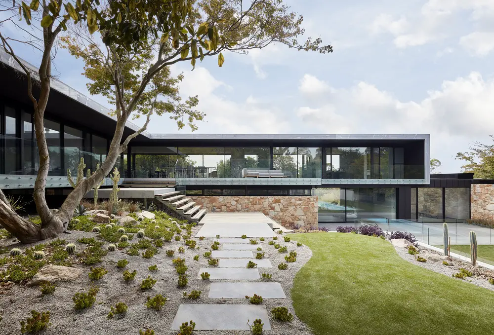
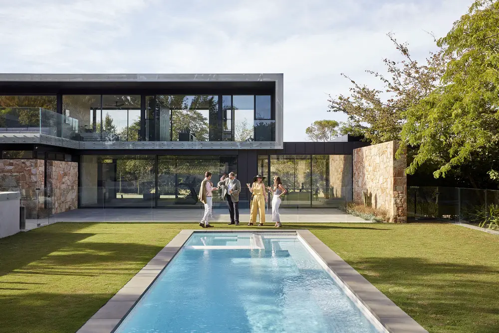
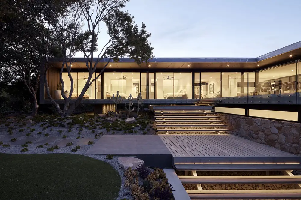
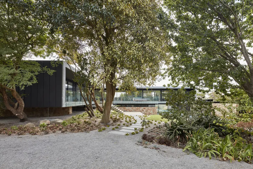
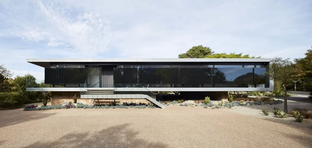
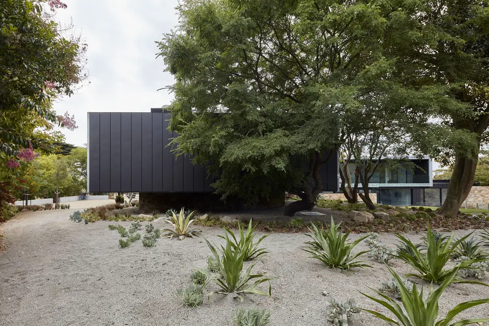
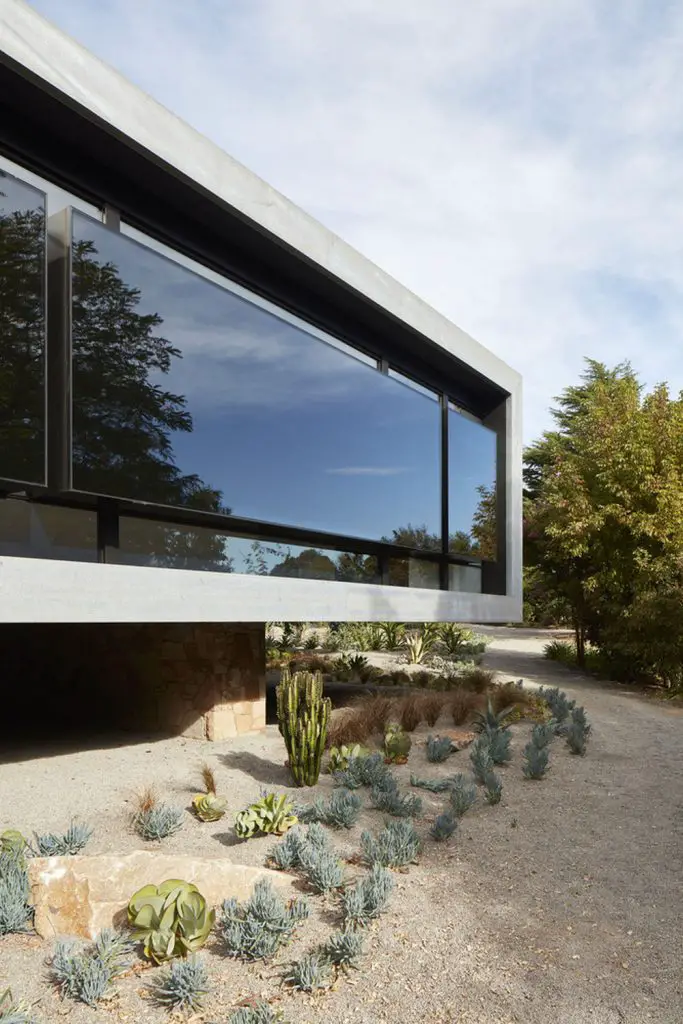
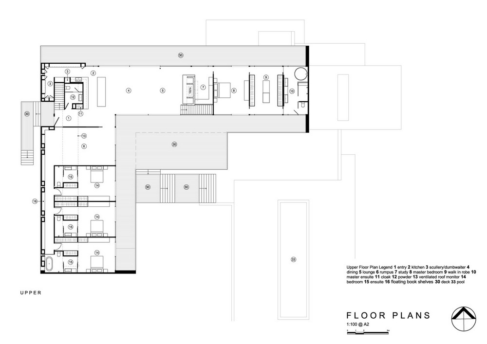
The west wall and its entry elevation was built for interaction and protection. From the outside, insulated black panels act as a defense from harsh weather, reinforced by raw galvanised steel. A bedroom sits on a cantilevered wing, supported by stacks of natural stone. This elevated area provides a view to the pool.
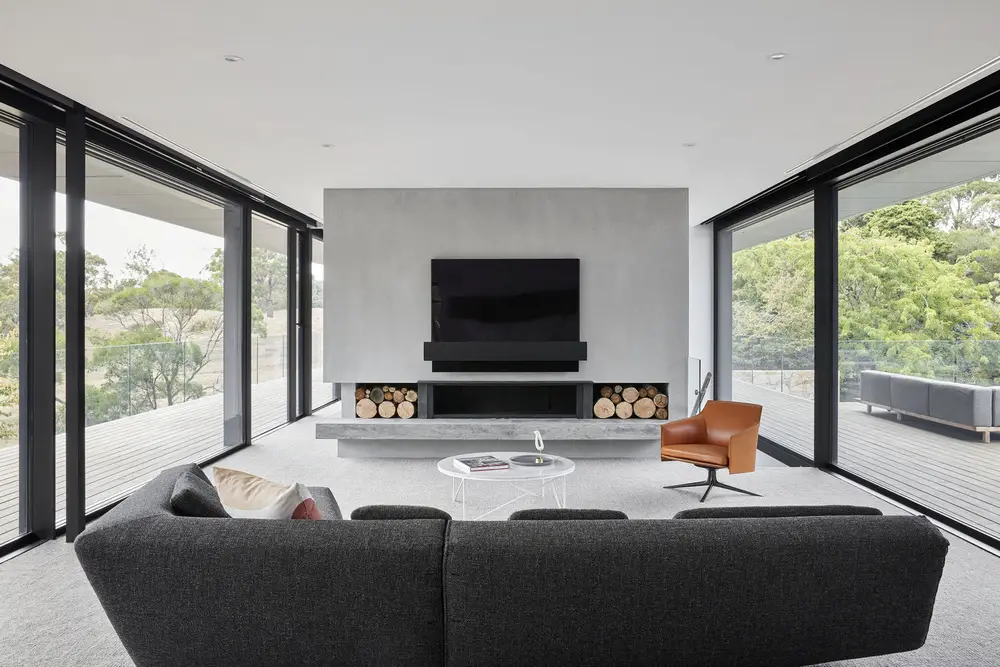
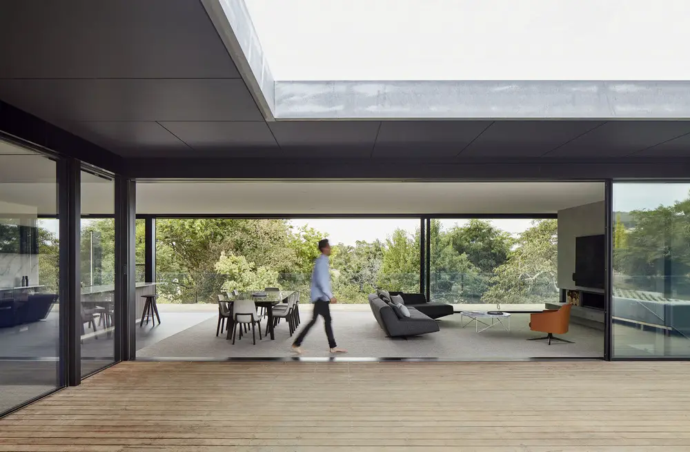
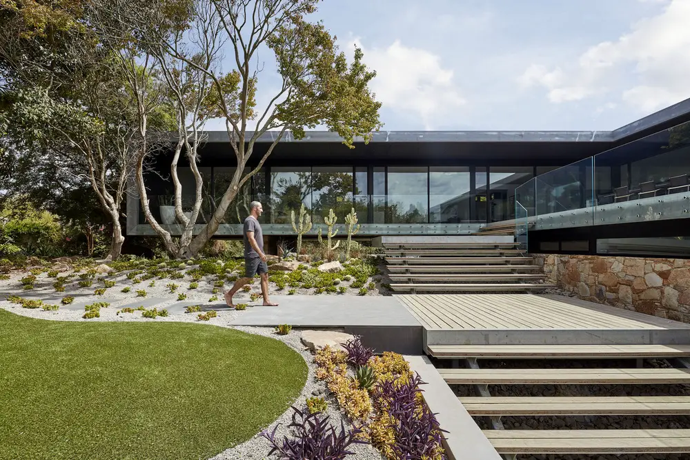
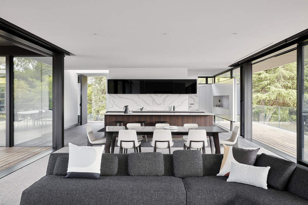
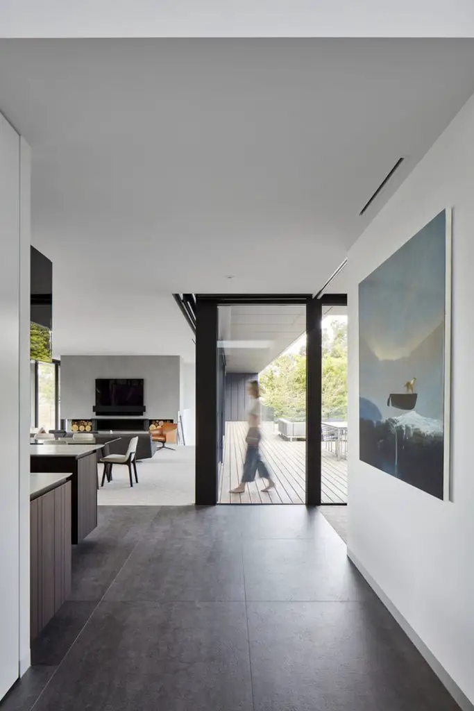
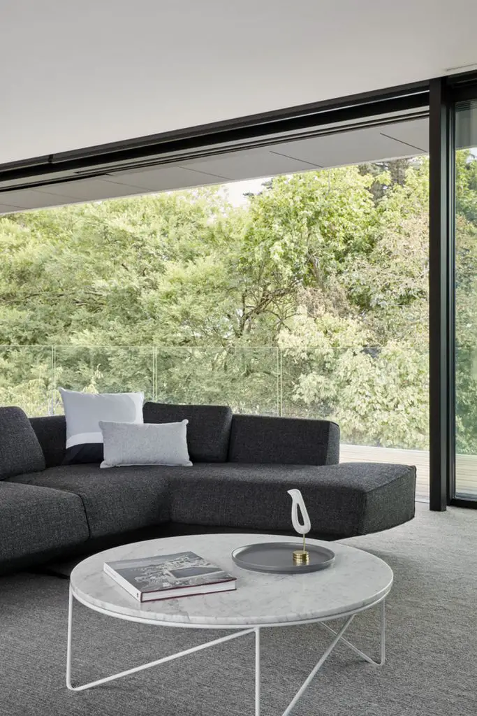
Floor-to-ceiling glass windows make Moat’s Corner House an observational point. It has unrestricted views to the garden, creating an indoor/outdoor experience. Simply put, it’s a home that celebrates life in every way. It reflects nature’s temperament – one that is erratic yet with a sense of balance and harmony.
Notes from the Architect:
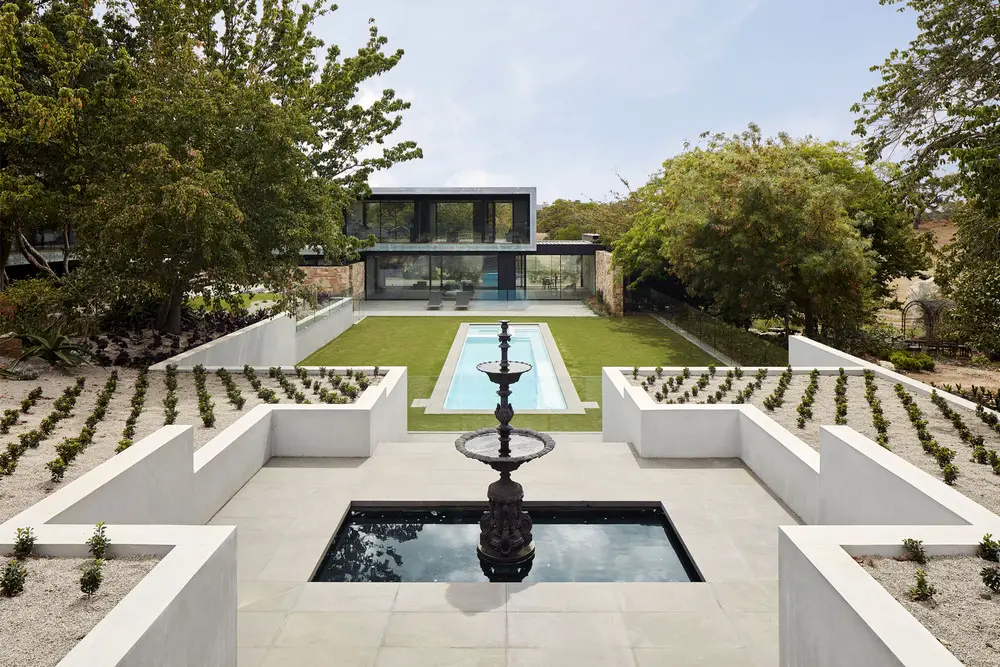
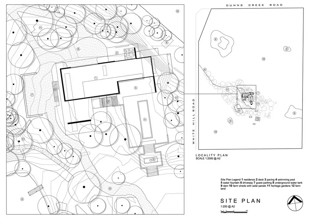
Moat’s Corner draws on an inspired vision and a commitment to an established setting. Refined to a point of tranquil precision, forming an interactive haven, with which to experience the life and energy that surrounds it. The sites layered history began with a pioneering family, after whom Moat’s Corner was named. Next came almost 70 years of a gardeners cultivating and collecting, resulting in a rambling and diverse array of flora across 5 acres of the 53 acre stretch. A new phase now and the owners’ commitment to create a home over the existing footprint set the tone for the design challenge – to respond to the integrity of its setting.
The elevated main level of the home observes the immediate gardens from a habitual perspective. Mid-canopy height, the glazed walls completely soak up the greenery that surrounds them.
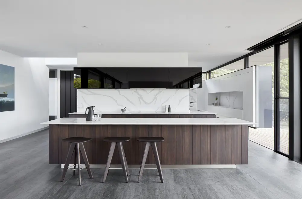
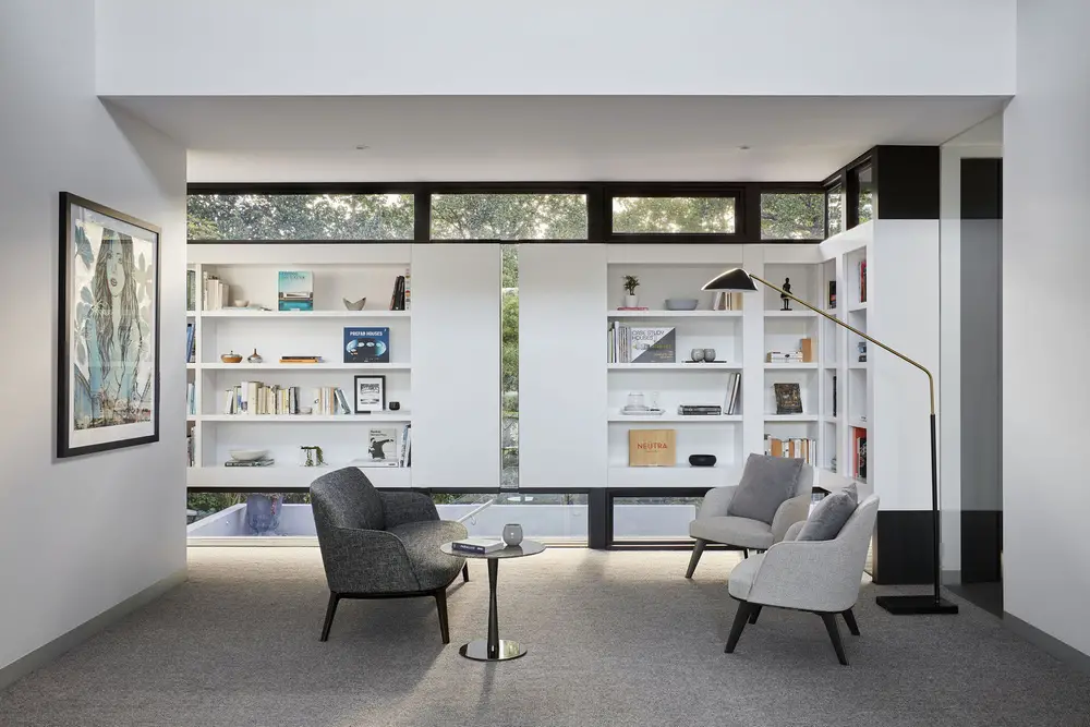
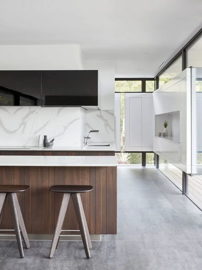
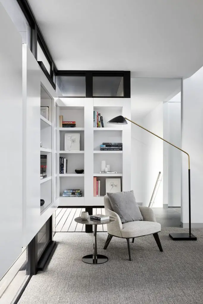
The west wall and entry elevation is one of protection, intrigue and interaction. From outside – insulated black panels spaced to a dual glass cladding guard for weather protection. But they are more appreciated at a sensory level, where on approach they completely fill with the reflected silhouette of the established west gardens. From inside – the panels take the form of bookshelves to the bedroom wing and bench top and storage to the kitchen, recessed and raised. They are framed with deep-set glass above, below and between, ensuring nature’s moments are never missed.
There is not a space within the home deemed principal or secondary that does not acknowledge the life that surrounds it, reflecting nature’s mood, unpredictable but always in a synchronised sway.
Click on any image to start lightbox display. Use your Esc key to close the lightbox. You can also view the images as a slideshow if you prefer. 
Exterior Views:
Interior Views:
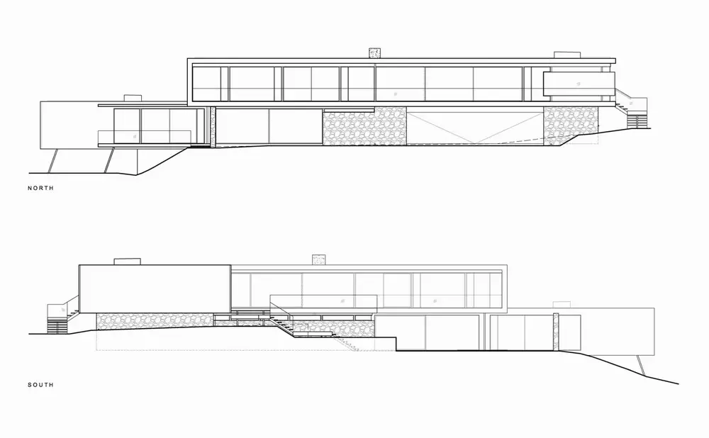
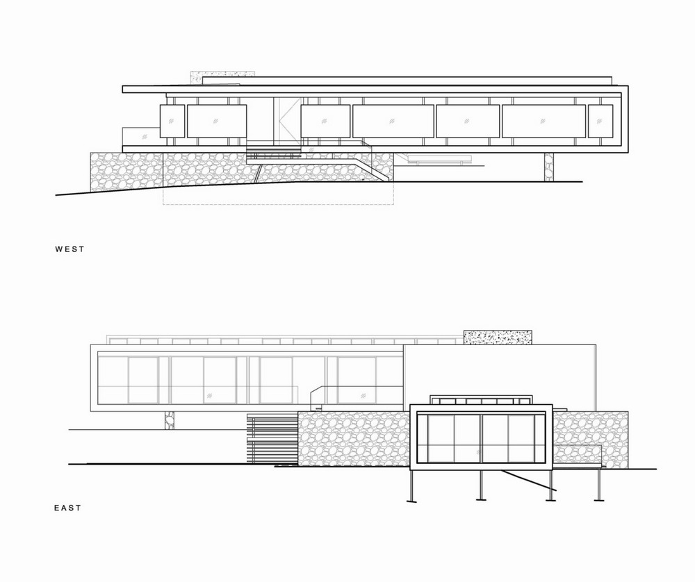
Drawing Views:
We think this might interest you – the Courtyard Home in Melbourne, Australia.


